Wednesday, 14 May 2014
Tuesday, 13 May 2014
Promo Book 2 (Final)
A better representation then the previous mock-up, the pages inside work really well as slivers I believe, giving you glimpses of each page of work. As well as that I'm happy with how the images and mock-ups look them selves on the pages. They all fit rather nicely within the DL frame. I'll make adjustments to this and add a cover page onto it seen as though it doesn't have the wrap around no longer. Include something on the front much to the same likeness as I did in the first initial mock-up.
Print Promo
Print Promo
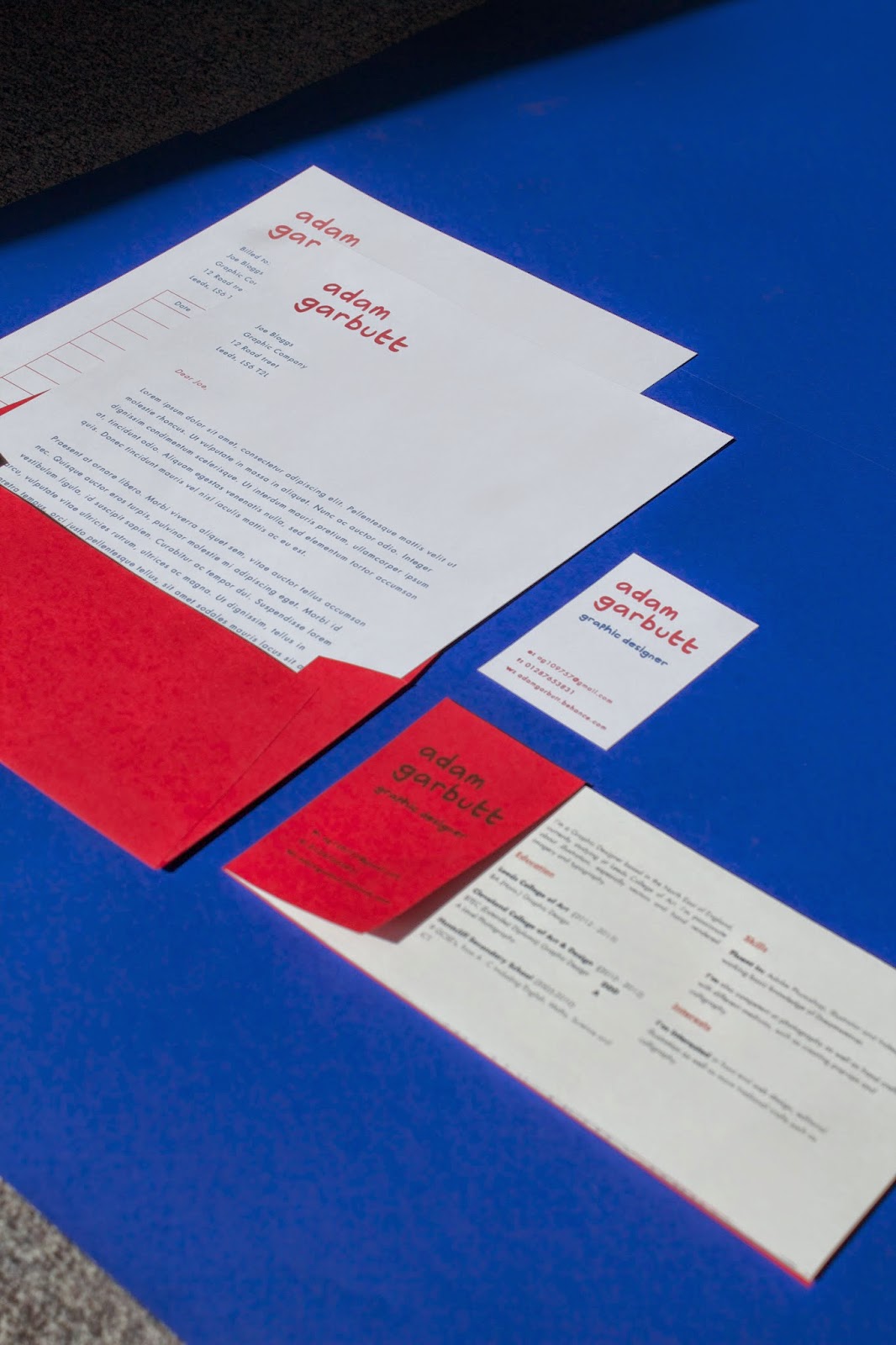
Branding Final Images (Take 2)
As a whole I'm really happy with my final branding outcomes, I think for a first attempt at branding my self I did a good job, I would probably change a few things such as my name's typeface to get something thats more accurate to representing my practice rather then me personally. The pieces all really came together nicely as a whole, especially the colours.


Monday, 12 May 2014
Promo book 1 mock-up
Initial mock-up of my promo pack portfolio to see how it would read if it was sent out as a pdf, Numiko been a placeholder here, however it is a place I would like to go to as a placement and someone I would send this out too. I think as a format, the DL size works on screen, It shows a lot and it's nice to scroll through too. I like it as a format because of the real estate it gives to images.
Promo 2
Promo 2
Branding Final Images (Take 1)
I took some initial photographs of my Personal branding for the presentation to give an idea of the direction I was taking because I had yet to finish it off. I took a photo of it all on blue paper from the library which was absolutely perfect. I really love how the contrast from the three colours, vibrant and I think that reflects my practice in it's tone it sets.


Cargo Web
I thought I'd sign up for a Cargo website, however it's not like any other site where you can just apply you have to send them a statement saying why you should have a cargo website. Which is a bit odd. However I was accepted.


I'll have to work the website some other time because I'm not to familiar with how it works but I will get around to doing it, maybe making this my personal website.

Sunday, 11 May 2014
Personal Branding Proposed Website
Since as though I'm not creating a real website, I decided to mock one up so I can get it how I want because I wouldn't be able to code it seen as I don't know how to do it like this and then launch it. It's something I want to do in the future however. I will probably try and recreate something like this on cargo or whatever but I will venture into that in the summer when I have the free time to fiddle with things for awhile, such as coding.


Friday, 9 May 2014
Notes
PPP notes:
2nd of june. 3rd year briefing. 11am.
Monday.
Placement: get a placement, form on estudio for placements.
Student placement form, send to tom.
Lecture theatre on Thursday. Cop proposals. Start at 10am on the dot.
Friday. GO4.
Branding Development
I tried to develop the a/g combo from my initial ideas but I didn't really work out. Just looked like an lowercase a still. Which is disappointing as I think it'd be helpful to define my self through a logo of some sort. However I wasn't too blessed with the initial characters in my name. I would use an alias I'm not sure were I'd start.


I wanted a simple business card that highlighted the important information, red really brought it out.


I really liked Mr.Bingo's Website, however I later found out its actually one from a template which is disappointing so I'd want to use that or something similar to get the same effect. It's straight to the point and says what it has to say. Love it.


Buttons and interaction using my typeface to personalise it.


I tried it using upper cases for my name but I wasn't as keen on it, I would probably do so if I was using a normal typeface.

I was thinking of using circle to highlight the links, like underscores. Dropped the idea because it was a bit too much. Too distracting.


For my letter head. Changed the body copy to Futura to be better for readability.


Created different nets to house the printed portfolio/ letterhead/ invoice, however I decided a DL would be the best solution so then I can house all 3 in a single card envelope. Making it easier, instead of having to make multiple different ones in different sizes to just send everything off.

Wondered what i'd look like in futura, not keen. Too plain.

Added in blue to bring out the fact i'm a graphic designer.


Created a portrait variant just in case to see if i preferred it. I didn't.

Because I'd be mailing this out to graphic design companies, I thought i'd use the word company as a placeholder, making it personal to them when they opened it.

Decided to make it the front for my CV instead and got rid of the hello company part, instead I'll place it onto the front of the envelope.

The red bit been a wrap around from the back, perforated to become a business card.

Subscribe to:
Comments (Atom)