Monday 22 October 2012

Contextualisation Task


As a small task we were to apply out typeface to context, so to place it within a situation where it would be fitting, I choose to put it into the following below: (rewrite)
After putting them all up on the wall it was really cool to see everyones work collectively in context.


Sunday 21 October 2012

PPP Question: 5

Am I up to date on my blog posts?

PPP Question: 4

Is everything tagged correctly?

PPP Question: 3

Does my blog communicate my progress as a designer?

PPP Question: 2

Is the work on my blog relevant and appropriate?

PPP Question: 1

Quality of work - Is everything explained, written work? Etc.

Alphabet Soup Evaluation & Crit

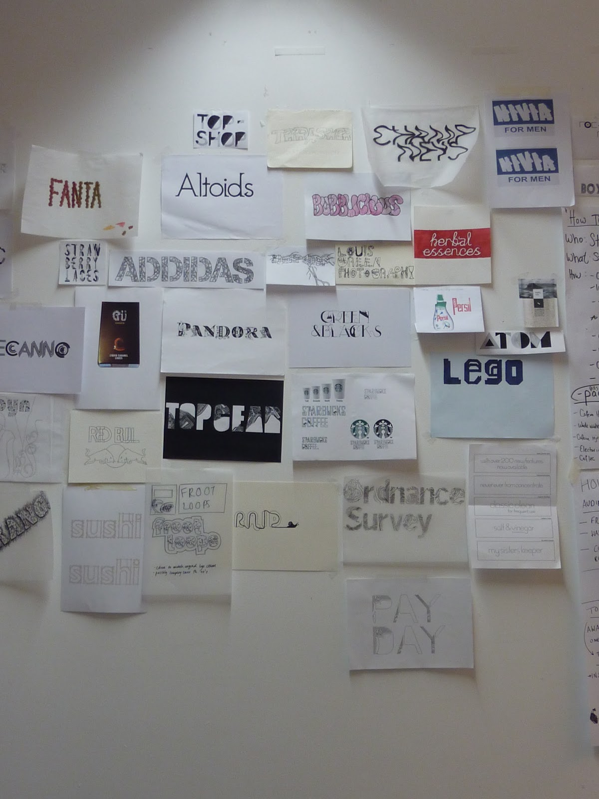
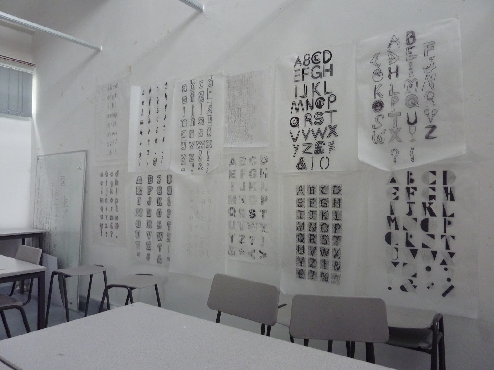
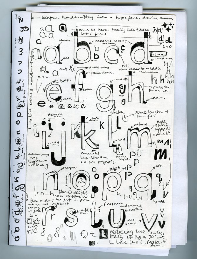
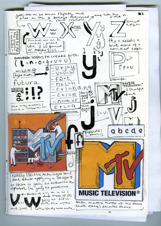
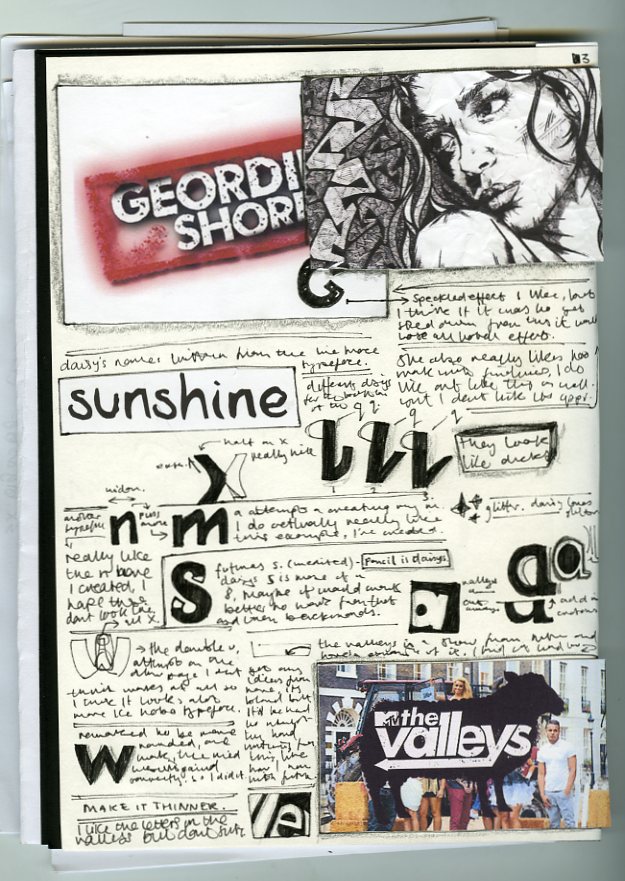
From the starting questionnaire we had I was given a lot of information about Daisy, I discarded quite a lot of it because I couldn't see it been of any use to much. In regards to creating typography from anyway, I looked through it for places to start. I suggested to write down each others handwriting, Daisy's had really great form and it was a instant inspiration to me, why not create a typeface based on her handwriting and influences in design. Taking a typeface which roughly represents her interests and bringing it together with her handwriting was my starting point and I went into tunnel vision from there. Creating her handwriting as a typeface. 

I have to say, a lot worked for this. The typeface merged beautifully with the handwriting, taking her mannerisms inside of her handwriting. A little of the form, the arches and kicks. Beautiful. It went along with Futura really nicely, aesthetically anyway...

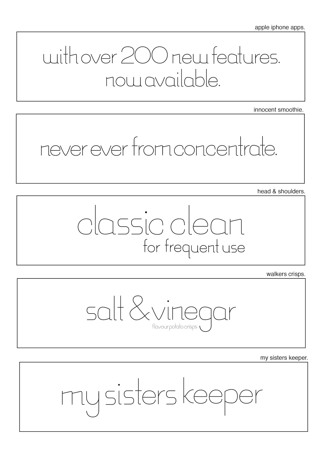
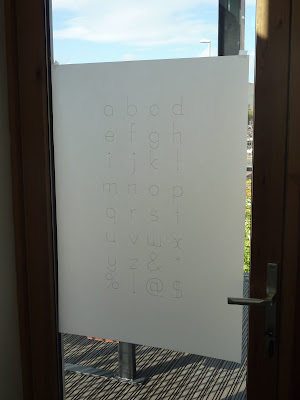
However what didn't work in the typeface was the transition from tracing paper to digital creating it. I found it just didn't feel right, it was bulky and although it represent her handwriting I don't feel it got across the messages I was trying to get across, such as it been her handwriting. So from there I created each one using the middle of the letters of each letter, this then became my final outcome which was then printed and traced onto the A1 sheet of tracing paper I then presented at the crit.

If I was to do anything differently, next time I think I would definitely look into my influences to bring into the design, I stuck to one idea and went all the way with it. Although I do like the outcome alot, I have to say, I feel I limited my self with the whole project and narrowed it down possibly too much. But then again the idea was unlike everyone elses and I guess this could it be it's one merit on not doing anything like everyone else? I don't know, but that'd be where I'd change my attitude if I was to do this again however.


In the crit we stood and talked about how we created our finals and what it represented in our partner. I guess mine was pretty straight forward on that it was the handwriting and the process behind creating it I mentioned. Also along with that how I took action on the previous progress crit on decreasing the size of the stroke [mentioned more in the practice post on the typeface's creation]. It was amazing to see everyones typefaces and I strongly feel daisy's typeface reflected me. It's weird because I never think what would represent me, but seeing someone else's interoperation of me was really weird and eye opening to see.


Friday 19 October 2012

Interval Crit

For the interval critique I presented my work that I'd created so far for my typeface based on Daisy, my current ideas been on recreating her hand writing into a fully formable typeface, using futura for my base typeface. I've been working into by using the base mannerisms in her hand writing and applying them to futura. I choose to use futura because of the similarities in the typeface and her writing were really similar in form, not mannerisms however, i.e: flicks and similarities to the forms.


The above were the pages I showed at the interval crit which includes the work I had done so far, with printed pages at hand as well. The feedback I got was to try and experiment with line and form more and to see about using a different typeface perhaps. - also work on design sheets.

Monday 15 October 2012

Feedback in Higher Education


Feedback & Evaluation: What is higher education?

Education in latin means to extract.

Higher education is how to learn from what I've already been taught. 

I'm the centre of my own education

Higher education is:
  • Preparing for mature life.
  • Learning through education. 
  • To synthesize different information to learn.
  • 3 years of unconscience learning and evolution of attitude.
Work is:
  • Training.
  • Learning.
  • Repeating.
  • Training.
  • Learning.
  • Repeating.
Formative feedback is:
  • Graded and assessed work. (At the end of the module.)
  • One-to-one tutorials. (Written + Verbal) (Or is it summative?)
  • Allows the tutors to adopt to meet needs of the students. 
  • Helps to monitor progress.
Progress tutorial:
Looking at areas for personal development and achievement, action and time planning. Any Issues.

There's many different types of critques. I should try and find one that works for me, find what works:

  • Concept crits.
  • Progress crits.
  • Group crits.
  • Final crits.
"Good teaching makes you ask questions, bad teaching gives you answers" 

Weaknesses with feedback provided for students:
  • Students don't understand.
  • Disinterested. [To give or receive, group work]
  • Failure, Don't know why.
  • Personal attack.
  • Group allow for hiding. 
  • One to one, overwhelming.
After this we had a group workshop to come up with questions we would want feedback on:
  • Time management
  • My practice.
  • My blog posts.
  • My engagement
  • Speaking, communication.
  • Contextual writing.
  • My feedback.
  • Amount of work I produce.
  • Quality of work.
Then as a group we collated these questions onto a big sheet, where we refined our questions down:
  • Am I upto date?
  • Quality of work? - Everything explained?
  • Labelled/
  • Revelant work?
  • Is it all referenced?
  • Progress as a designer.
  • Where I've one wrong and right.
  • Clarity and Organisation. 
  • References, advice.
  • Formative feedback. 

Intended scale


An on going collection of images and design that show:

Intended scale.

http://www.behance.net/gallery/Walking-fingers-(Scratch-Lottery-Commercial)/2577173


http://www.behance.net/gallery/15-years-VIB-Event-and-9-Books/2433073


http://www.behance.net/gallery/Year-of-Soybeans/4408755


Function

An on going collection of images and design that show: 
Function.

Furniture.

Diet Coke promotional web series.

Exibition Advertisement.

T-shirt concept design.

Advertisement.

Editorial illustration.


[Dexter] Television series introduction. 

Exhibit piece put into contextualisation.

Rubiks cube for the blind.

Outdoor exhibition piece.


Old Spice promotional web video.


Weetabix advertisement.


http://www.behance.net/gallery/Plywood-Chair/638683
http://www.typographicposters.com/mitch-goldstein/
http://www.behance.net/gallery/DIET-COKE/905975
http://www.behance.net/gallery/Glennz-Tees-Concepts-for-Voting-Jul-Dec-2012/5422785
http://www.behance.net/gallery/Editorial-illustration/5155973
http://www.behance.net/gallery/Rubiks-Cube-for-blind-People/451134
http://www.behance.net/gallery/Scotland-Monkeys/4717241

Tone of voice

An on going collection of images and design that show: 
Tone of voice.

Message & idea

An on going collection of images and design that show: 
Message & Idea.

Design context

An on going collection of images and design that show: 
Design Context.


Wednesday 10 October 2012

Alphabet Soup Evaluation


In the crit our partner was tasked with choose 5 from our collection of 10 we had created, vice versa, then these from the groups we were in were put onto the wall. This was really cool to eliminate some of the weaker ones to see everyones strongest outcomes, Sarah choose the right letters to take out I feel and I'm glad I wasn't the only one to see the weaker additions to my work. We then switched tables and took down another groups letters they had put up, bringing their wall collection down to 5 as well, over all out of the 10 of them. The letterforms that were left up I feel were the right ones, we worked well as a group and I actually enjoyed this crit. It was a bit different to what I'm used to but it was great way to discuss the letters over such a long period of time and still being active with what's going on.


For my final letterforms, I have to say I'm pretty pleased with them. I think some are a lot more powerful then the others, notably the T and the W. I feel are maybe two real powerful ones. I think that's maybe because of the enhancement through tracing them and on top of that using A.Illustrator to create the effect. In mind for them I was thinking how to combine layers in the third dimension, Instead of flat layering, inspiration from M.C.Esher there a little bit. The two I feel that don't really work would go to the G and H. Simply because the effect isn't all that to clear and they just aren't stand out, personally. It was an idea I had, I just couldn't execute it how I wanted to in time. The other letters I feel have middle-ground such as the D and the B (which has similarities too the E. But they feel really obvious to me and I don't feel much for them. 

Sunday 7 October 2012

What is Graphic Design? [Part 2.1]

From the research images we had picked based on 5 words we had picked, we then picked one from each and wrote their: Function, D. context, Tone of Voice, Message/ Idea/ Context and intended scale. From there we then laid all the rest of the images in-front of us, in our blog groups and from all them we then wrote down all the functions they were performing, the design context and repeated this for each category. This resulted in a list of words we can work from to then look up different pieces of Graphic Design to work from when it comes to researching later on:

Function:
Inform
Educate
Aware
Explain
Advertise
Question
Provoke
Promotion

Design Context
Awareness 
Film poster 
Illustration 
Branding 
Publishing maps
Billboard 
Book cover
Window display

Tone of Voice
Humour 
Serious
Playful 
Informative 
Condescending 
Friendly 
Formal

Message / Idea / Context
Political
health
promotion 
persuasion
inspire 
ethical

Intended Scale
T-shirts
window
screen and web
walls
billboard
magazines
books
exhibition 
wood board
stationary 
packaging
human body 
books
signage 
bags 
boxes

    Saturday 6 October 2012

    What is Graphic Design? [Part 2]

    [Study Task 2] 'What is Graphic Design?' [Part 2]

    These are the 5 words I picked from the 14 from the board, from the research we did we then had to pick a further 5 from the collections we had created from the images found. Of these 5 we then had to write about the following 5 words relating to the images and design pieces.

    ----------------------
    Function
    Design Context
    Tone of Voice
    Message / Idea / Context
    Intended Scale
    ----------------------


    • Function: Art Exhibition.
    • Design Context: Typeface, made into 3D letter forms.
    • Tone of Voice: /
    • Message/Idea: Converting hebrew typeforms into a 3D shape.
    • Intended Scale: The letters are all quite big, with posters on the background showing their development and how they're made up from different shapes.

    http://www.advertisingserved.com/gallery/HSamuel-Worth-A-Look/736733

    • Function: Advert, Interactive
    • Design Context: 'Look at these amazing things!' - Worth a look campaign.
    • Tone of Voice: Humour.
    • Message/Idea: It's worth having a look into H.Samuel's, positions setup to look through into.
    • Intended Scale: For on windows. [Shown above]

    http://www.behance.net/gallery/Blackbird-wine/3244267
    • Function: Wine Label
    • Design Context: Fancy wine bottle, based around birds.
    • Tone of Voice: Humour? ( I can't tell )
    • Message/Idea: The bird is pecking out a letter from the type.
    • Intended Scale: For a wine bottle label.

    http://www.typographicposters.com/andrei-ograda/
    • Function: Exhibit advertisement?
    • Design Context: Poster
    • Tone of Voice: [ I'd be able to tell if I could read, but possibly arty?]
    • Message/Idea: Persuade to attend.
    • Intended Scale: Poster [I can't read it]

    http://www.behance.net/gallery/Typography-lover/5142265

    • Function: Art Exhibition.
    • Design Context: Hand cut paper poster
    • Tone of Voice: Retro?
    • Message/Idea: To advertise and promote.
    • Intended Scale: Can't tell from this piece because this is a photograph of the original cut.


    What is Graphic Design? [Part 1]

    Previously tasked with selecting 10 images of our personal and creative interests into Graphic design, we then in our blog groups explained to the group why we liked the pieces selected. Going around the group, we each talked about our images then wrote down the reasons. We then put down the most common ones then got them on the board. As a class we created 14 different words to pick from. From them 14 words we picked 5 words each then from them. 5 images relating to them words:

    • Creative use of type*
    • Attention to detail*
    • Tone of voice
    • Detail
    • Simplicity/minimal*
    • Meanings and messages
    • Visual content
    • Interactive audience engagement*
    • Style aesthetic*
    • Media production
    • Form & format
    • Personal interest
    • Language
    • Structure & layout


    Creative use of Type:
    I choose pieces of design that varied from each other, for creative use of type I looked a bit too much into Sagmesiter & Walsh but I do feel they are really creative with type. The materials used, the forms and ways in which they display them. Anyway, I wanted to show a varied and I think I got that.


    For attention to detail, I choose pieces that weren't perhaps incredibly detailed, but the detail that had gone into them, the outlined ear bud one for example takes details from the face and replicates them simply with lines, it's not an incredible drawing but it pays a lot of attention of detail to getting them right, such applies to the rest of the images I choose.

    http://www.digitalartserved.com/gallery/Earplug-Portraits/4535663
    http://www.behance.net/gallery/MTV-Music-Television-Download-Bar/4363897
    http://www.behance.net/gallery/MAPS-a-journey-around-the-world-in-pictures/5287153
    http://www.behance.net/gallery/Typography-lover/5142265
    http://www.typographicposters.com/kouglof/
    http://www.typographicposters.com/homa-delvaray/
    http://www.typographicposters.com/goncalo-leite/

    Simplicity of Design:


    Simplicity of design seemed like It'd be easy, but I didn't feel like a lot of minimalistic designs were really all the good, I wanted pieces that were smart or at least creative.I found these mostly on typographic posters as I felt this is where alot of designs are gonna be easy to find in a professional enviroment that display simple aesthetics because of the sheer amount of the posters up on this blog.

    http://www.typographicposters.com/hort/
    http://www.behance.net/gallery/Shared-Voices-Posters/4700315
    http://www.behance.net/gallery/Blackbird-wine/3244267
    http://www.typographicposters.com/kiko-farkas/
    http://www.typographicposters.com/toormix-11-years/
    http://www.typographicposters.com/pedram-harby/
    http://www.typographicposters.com/i-like-birds/

    Audience engagement / interaction:


    For audience engagement I picked design pieces there were something you can't really avoid, billboard, a map, bus-stop poster and a window engagement [H.Samuel], I always found you have an engagement with them and they're something I find my self always influenced by. 

    http://www.advertisingserved.com/gallery/HSamuel-Worth-A-Look/736733
    http://www.behance.net/gallery/Levis-Kinetic-Billboard/2665059
    http://wearefounded.com/baltic_shop.htm

    http://inagorillacostume.com/wp-content/uploads/2011/06/District-9-Guerrilla-Marketing-Movie-Bus-Stop-Poster.jpg
    http://www.bbc.co.uk/london/travel/downloads/tube_map.gif

    Style or aesthetic quality:

    FI picked a variety of different styles and aesthetics, vectors, traditional and pixel art, there's too many I could have picked from so I tried to keep it narrow and limit my self because i felt my self going wild with this one and I wasn't to sure how many to pick, anyway, I'm gonna continue this collection i really like how this one is going.