You can categorize Graphic design down into 5 key areas:
Branding and Identity
Brand
The perceived emotional corporate image and over all feel as a whole.
Identity
This is the visual aspect to a brand
Logo
This is what a business uses to be identified, using a symbol or icon.
Editorial and Publishing
- Magazine Design
- Catalogues
- Zines
- Instructions/ Manuals
- Books
- Comics
Covers all of these from general publications to self publications, includes page layouts, cover designs and everything in-between. etc.
Product and Packaging
- T-shirts
- Calenders
- Birthday cards
- Wrapping paper
- Tags
- Stationary
- Boxes
This is where designs are sold, or are the product, this is market and type of Graphic design is driven by designers.
Retail and Promotion
- Signage
- Posters
- Clothes Tags
- Shopping bags
- Points-of-sale
This is often where Graphic design can look alot like Fine art as the designer has free reign in been creative. Very similar to Product and packaging as they're both aiming for a similar goal, to sell something.
Information and Way-finding
- Information Graphics
- Maps
- Plans
- Signage
Navigation design and way-finding is to help people around and get them to the right destination using a combination of maps, signs and symbols. Information design is the simplification of complex information to be made easy to understand.
Branding and Identity
Consistent
This is the branding for the Baltic Art gallery, they've achieved an very consistent overall look within their work, it's all very varied but it's all immediately identifiable as it is related to one another. It's achieved this through a consistent use of typefaces, layouts and use of colour within their work. It's incredibly effective and it transcribes it's self through all their different work they produced for the branding.
Audience
For the Muska Music branding it feels like they've aimed it at a young adults who want to be cultured by music, it appears high-end but it carries the feel of a hip blogger. It's slick and It's rather effective in the look it's going for and it appears to be fashionable.
Tone of voice
The bees are all a childish but playful design which gives the different logos a fun tone of voice. This is not that effective in getting its message across and only with research can you find out that it was designed for print solutions. The message of a fun and friendly service is there but it isn't obvious who and what it is about.
Audience
This branding for this website (high fashion clothes at the lowest prices) has missed the mark. The colour scheme seems right for the audience, however the overall look doesn't look exclusive and high class which it should when that is what it is trying to sell.
Audience
The branding on this website for Viva speaks to its audience by using bright vivid colours which reminds you of face paint at music festivals which is one of the things that they show on the channel. It ties in with the programming which ties the branding and the company's purpose together. It has bold type and big images which give fast information to the user which appeals to the teenage and young adult audience of the music channel.
Corporate
This looks like it is trying to be Eco-friendly and high class. It is trying to appeal to high end companies to use their energy sources, so the look they are going for influences potential customers. However, it is influenced by already existing companies that try to appear environmentally friendly such as BP, and loses some of its edge and effectiveness.
Before:
After:
Subtlety
After a backlash, the branding for Gap they brought it back to the old logo, after that they subtlety changed it to appear more modern by simply squashing it down. I think this simple subtle change really worked, it's still sticking to the old look but it's still appears to be new and fresh even if the change is ever so slight.
Consistent
This branding and identity made for Casa da música is incredibly consistent, using an application to change the look and feel of the logo to correspond with the people who played at the venue, this was to show the all the different types of people that played there and the different colours of music. It's incredibly effective in it's concept and outcome because of this.
Consistent
This consistent branding of the clothing label Blue creates a instantly recognizably theme and element to the brand, It's clearly not blue, it's orange and It seems as if it's supposed to be a joke. It's remember able and it's stuck to that throughout the rest of the branding, it's stuck to it and it adds that more humor to a high-end label.
Colour
The use of colour in this branding of the Adobe suite makes the product they're trying to sell appear new and experimental. I feel like what they've done here hits the mark when it comes to selling software, It comes off as something that's going to create high end and polished work, they've made not what they're going to be able to create with it but the adverts for it's self appear desirable.
http://wearefounded.com/all-projects
http://www.sagmeister.com/taxonomy/term/18
http://www.larsen.com/portfolio/category/branding-and-identity/
http://www.branded.co.uk/#/case-studies/mtv-viva
http://tolleson.com/studies/
Editorial and Publishing
Concept
The concept for this penguin book I really thought was clever, the book is all about censorship and it plays with that in the title by placing the black bars over the title and author using black on black. It's an effective piece of design and I love how it toys with it's own content in this way.
Layout/ Audience
This publication outlines it's self as a Penguin Classic from it's layout, ignoring the picture above the white bar it's instantly identifiable to what it is and what series it's from. A child wouldn't come and pick this up because it's not attempting to attract them too with it's colours. They're set back and are more about the content rather than the layout of the front cover. They're trying to appeal to an audience more interested in the literature and having a layout set the same as every other is a way to attract them to find out more from different pieces of writing.
Layout
The layout of the magazine cover I think, although Is particularly different, It really catches your attention because of this. You see it's for Graphic designers and then you're snaked down the information looking at the images and then to the information. It's an incredibly well laid out piece of design even though it breaks a few rules, while it's still laid to a grid it just break it down and work with it.
Audience
It's obvious in this publication who's it's aiming for (graphic designers) otherwise there wouldn't be such a great expense in making every page desirable and attempting to be a piece of inspiration instead. It's a very considered and it's really pulled it off through layout, colour and aesthetic and a metallic printed section!
Colour/ Audience
There is a commonality within each of these publications and that's the intense amount of color within in each one, the huge titles on each. There's often a very clear focus point that you then expand out-from into all the other intricities of the page. It's really effective and it's obviously so because they're rather famous children's books.
Colour/ Audience
The colour for this publication is needed to invoke the curiosity it's aiming for within Children, it's audience. It's brightly colored to draw their attention towards the different illustrations been talked about within the written part, possibly spoken by the adults to their children then shown. It's really effective and you are drawn throughout the double pages to each and every animal on it.
Colour
Even though the colour palette is limited here, They've used the illustration on this publication to draw you in using the colours of the tree branches and leaves. These pull you towards the squirrel and the title. The focus points, and as layouts work really effectively. It's certainly eye catching.
Layout
From within the inside of the publication above, I really like how story telling is done within these books. The layouts work our over use of Left to right, expecting you to read that way. It's evident the grid they're using is the one the size of the small boxes because the bigger image takes up that space.
Tone of Voice
Sometimes the tone of voice sells a book, and this one did for me. Texts from Dog from the starting point explains it's stance with its Tone of voice, it's not to be taken seriously at all. 'My dog sends me texts. Yeah it's weird' It outlines it's self there and follows through faithfully. You know what to expect and you get it. It's a great use of tone of voice and It's an example I really like.
Colour
I have to admit, this an awful book looking cover. It looks particularly cheap and tacky, but it does work it's layout rather well. The hierarchy is in effect and you work from author to title to the small print in-between in order because of the use of colour, all similar in hue just different in shade and tone. It works it, the high contrast between the orange and yellow brings you in and then again to the bright yellow and orange again.
http://www.penguin.co.uk/
http://www.scholastic.com/home/
http://www.nobrow.net/
http://www.computerarts.co.uk/
http://www.headline.co.uk
Product and Packaging
Audience
I wasn't too sure what to say of this piece, I feel confused by it. I can see it's trying to look old fashioned, perhaps appealing to that audience. But at the same time I feel like it's trying to be really modern in the same respect. It's trying to appeal to an 20-something audience with a hip and modern branding of beer, it does a good job at it through them two elements, I wish it had what It actually is more clearly on it's front instead of a tab which seems a bit useless when the logo is already pasted twice on it, on the top and mid.
Colour
Colours play a big part when it comes to health-wise produce, using soft pastel colours to show good health, such as here they've incorporated the colours of the pomegranate as a indicator of flavour. I think as a design piece It's really effective, it follows in the footprints of other health wise brands but it's a recipe that works time and time again as it's become synonymous with been healthy (strong colours/pastels).
Concept
I really like this product for creating a packaging holding them, more so than the actual product. The type on it is a bit uninspiring as it seems like it's trying hard to be 'hip' beer and kinda of jars with me a bit. anyway, It looks incredibly practical for such a fragile item. As with it been made of cardboard it's gonna be reusable and strong and easy recyclable, that's a crowd pleaser.
Concept
I've always wanted to see tiles been used as a application for design and I thought this one really pulled it off. Although in a retail environment as a product I think it's still a viable option and like here they're using the tiles to create an end image and product. I think it's a great concept, even though the example here isn't that great it could be expanded upon and taken further.
Consistency
Just looking at these bottles and you'd think they're all the same, in fact upon closer inspection they're actually really different. It's an incredible job of creating consistency on their part through the use of the grey illustrations behind and the use of the layout while keeping each product different through colour and they they still keep a overall look consistent.
Colour
Colour here is used very effectively to draw you into the cup, You don't see many coffee/tea cups that are so striking and in your face. It's not to tacky and I think that's a reason it's working for this piece, it's subdued and they work together rather well, particularly the blue and maroon. It's a good use of product colour because of the attention it grabs and how well it's working it.
Parody
I'm a big fan of Arrested Development here, the joke been when a character paints him self blue remarking he just 'blue' him self. Although the product isn't real, the design of it is convincing enough to be regarded to be an actual design for Ben & Jerry's Ice cream personally it caught me out. It though it was a great attempt at parodying the series in twist with the product.
Context
Similar to the Ben & Jerry's Ice cream, except these were actually made, make reference to the series 'Breaking Bad' the Chuck Taylor's were custom made and picked up by the actor him self when he discovered them online. It's something that would only apply contextually to the people who've seen the show and one of the people to take notice is the actor who plays the character depicted on the shoe. Using context to your advantage and really come in your flavour sometimes as it's applying to an audience with an instant understanding of what it is rather than introducing them to something new.
Audience
This is wine produced for someone who is rather into their mystery and crime, it's wine for perhaps late 30's early 40's type of person. It's rather reserved in it's look and a drastic load different to the cider below. I appears more mature in it's look and you can see that's heavily based on down to it's audience, because of the different labels on the bottles.
Audience
The audience for this is obviously made for someone wanting to experience some class with their Cider, even if cider isn't all that well associated with high class. It's audience is possibly aimed at someone in their late 20's, it's clean but with it's use of rather old fashioned desaturated pictures of the fruit used depict something other than your everything Bulmer's cider and it's establishing that through it's look very well. It's creating desire through it's packaging and I don't think top of the range cider is on the minds of teenagers.
http://www.moontroops.com/portfolio/
www.lasersbrothers.com
http://www.studiomuti.co.za/
http://bradleyrogerson.com/
http://jonnyetc.prosite.com/18214/220082/portfolio-/pop-culture-ice-creams
Retail and Promotion
Aesthetic
I really like the styling of this bar, for what I am assuming is Greek yoghurt? Or at least greek cuisine. It's the appropriate combination of the ancient greek pottery patterns followed in with the aqua blue really goes well together. The black ties to altogether and it gives of a very slick aesthetic, I find my self really appealed to it.
Layout
I never thought I would see office chairs laid out so well, the presentation of the chairs gives them the look of been something of a sports car. They're successfully showing off something of such a rather dull nature been rather something to desire. It's down to just how they're laid them out and the over arching aesthetic and presentation, instead of just been in metal warehouse shelving like you'd typically find at staples.
Colour
For a surgery, I think black is probably the last thing you want to be surrounded by, It's an attempt at making the surgery look a lot more slick but I don't know if it's all that tasteful and nice. The colours seem to be heading in a good direction and the typography work on the wall is nice but it's too much. I can't help but think they could have just stuck with 3 fonts.
Aesthetic
For promotional use this poster I thought was rather smart, It's for a Science lecture, the advert actually drawn in chalk. It reminds me of photos of famous scientists writings on chalk boards and I think the link between that is immediately clear. It's an incredibly familiar aesthetic that one can instantly get a gist of what is happening with.
Audience
Every store front tells you it's audience and it's always clear, particularly here. The clothes, lighting, window furnishings give it all away. It's going to be an expensive shop, it presents it's self as prestigious and high-class and that's a hefty price tag. The font choice also indicates this, script followed with light san-serif it's almost the ritz.
Colour
I sometimes forget Vodafone is a phone company, I hardly see the stores. I do however really like the use of colour where it is used. The red is only where it's needed to draw your attention. Everything else is grey, except the phone display box been red. You can't help but be draw to it. I think it's an excellent use of colour.
Colour
I really like the aesthetic of this place, which I believe is a shop of some kind. It's most probably down to the colour, alike the Vodafone store the use of blacks and colour to bring you to certain spots is in reality totally subconscious but when you see what they're doing here it's rather interesting. Coloured seating, displays. etc. Yet floors, walls grey/black. From the outside it'd just look a bit bland but what it's doing is really effective.
Aesthetic
Sea and water themes are normally always really cool, this been an example and I think it's an aesthetic that works really well in bars/retail. It's calming, with some smooth music I''m sure it's a place you'd want to go to like any body of water. It's rather relaxing to be surrounded by blue and reflections.
Colour
Using colour without having it in colour would be a travesty, but surprisingly it's also rather tasteful. I really like what's been done with this, it's attractive and a rather modern display piece in a office space. Reminds me of technicolor. The use of colour on colour is what makes it stand out so much and it's what draws you towards it. It makes it interesting.
Concept
I really like the concept of this billboard, even though it's rather dull. We all work and we continue to work. The gears turn, like clocks everything carries on. It's interesting and it says a lot about the Levi brand, it's for the average person, and also it's roots. Been workers originally, because of denims tough properties. I really like it.
http://redantler.com/work/
http://www.coming-soon.be/
http://retaildesignblog.net/
http://yoddesign.com.ua/proektyi-2/
http://www.jessicawalsh.com/
Information and Way-finding
Layout
Although it's layout is rather simple, It's rather effective too. Taking use of the fibonacci sequence it seems, upside down. The layout is what makes this work well. It's really well set out and you can flow from one piece of information to the other relatively easy.
Audience
From this piece, i think it seems to be talking and trying to impact secondary school children, it appears to be like the graphics found throughout GCSE books. The approach i'm getting from it anyway. It's flat and uses a lot of gradients. It doesn't appear to be trying to be slick just presenting everything as it is to be easy to understand.
Concept vs. Content
I do like this, although It's not really my thing. The concept behind it is rather neat, photoshop information onto someones body. The only problem with it is that it just doesn't seem to be all that relevant to the content it's presenting, they don't go together all that well so it's not as effective as it should be.
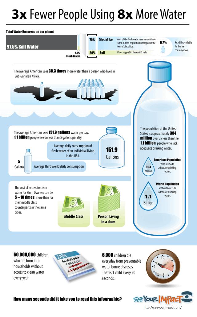
Colour
Colour is incredibly effective when it comes to communication information, this been a particular example. The colours allow you to mentally split up the information much easier then you would do without them, just greys for example. Although it's not apparent at this scale what the information is telling it is easy to separate the different chunks from one another easily.
Shape
Different shapes used can also influence just as much as colour how we read information I've found, Circles been the most effective. Penta/hexagons been also just as effective. I think these shapes are also just as good, they're represent rough circles and because of that like here they're able to show the information clearly. The edges make it appear to be much more like chunks to make it easier to divide it up.
Flow
Reading information is often difficult if it's hard to follow, this example been the opposite of that problem, you can follow the road map of it really easily. The colours help divide it up. I really like this example, for how much space it takes up, it's effective. I wouldn't say needed but it really helps you follow it easier.
Layout
I find it rather hard to figure out where I'm supposed to go following the information on this piece, I think t's a good example of why layout is often needed when you're dealing with information you're trying to show as important, If I'm not lead to it, I won't know about it.
Colour
Colour is also great for it as well, it's effectively used here and directs your attention with the correlating information next to it throughout the image. It's a great piece and the multiple colours really make it happen.
http://visual.ly/
http://www.peterorntoft.com/HTML%20filer/infocontext1.html